ConnectED Fellows
A ground-up redesign of the ConnectED Fellows nonprofit website in partnership with Develop for Good, serving education leaders across rural Guatemala, Nicaragua, and Colombia.
A ground-up redesign of the ConnectED Fellows nonprofit website in partnership with Develop for Good, serving education leaders across rural Guatemala, Nicaragua, and Colombia.
Product Design
Role
Product Designer
Status
Shipped August 2026
Type
Nonprofit · Website Redesign

Problem
Problem
A growing nonprofit’s WordPress site couldn’t explain its model, show donors their impact, or surface Fellows’ stories, and the team had no technical staff to maintain a rebuild.
Solution
Solution
Restructured the navigation and information architecture, and redesigned the FAQ, post-donation hub, and testimonials page, all built as no-code components the client can run on their own.
Results
Results
Shipped August 2026 and live today. Donor-campaign visitors show an engagement rate above 80%, and the client now updates the site independently.


Project Overview
My Role: Lead Product Designer
Timeline: May to August 2026
For: ConnectED Fellows, in partnership with Develop for Good
ConnectED Fellows supports local education leaders across Guatemala, Nicaragua, and Colombia. As a Product Designer on a Develop for Good team, I helped redesign the site’s core user flows, homepage narrative, and donation experience so non-technical stakeholders could connect with prospective donors and partners.
I owned three pages end to end, from wireframe to final design: the FAQ, the post-donation engagement hub, and the testimonials page.
01. Context & Problem Space
The Background
ConnectED Fellows is a nonprofit that equips local educators in rural Latin America to lead community-driven educational projects. With its expansion into Colombia, the network now reaches 92 schools and over 19,000 people.
Despite that growing impact, the website, the primary touchpoint for donors, corporate partners, and prospective fellows, was underperforming.
The Problem
The existing site failed to convert casual visitors into active supporters because of four design friction points:
Dense, Academic Language: The site relied on academic terminology instead of clear, relatable storytelling, so visitors struggled to grasp what the organization actually does.
Opaque Value Proposition & Model: The 2-year fellowship model and its 7 phases were buried across subpages instead of introduced on the homepage.
Unclear Donation Impact: Giving felt transactional. Donors couldn’t picture how a $50 gift versus a $250 gift created change in rural classrooms.
Dead-End Post-Donation Flow: After donating, the experience ended abruptly, with no path to stay involved.
Technical Constraints: The client had no technical staff, so every solution had to be modular and easy to manage in WordPress without custom code.
02. Research & Strategic Design Goals
Each designer audited the existing site to find where information felt unclear, and we combined those findings with the questions the client hears most often. From that, we set three design objectives:
Clarity & Storytelling: Restructure the information architecture so any visitor understands the mission, model, and geographic reach within 10 seconds of landing.
Transparent Giving: Design an impact-linked donation experience with clear preset tiers and flexible payment options.
Sustained Engagement: Turn the post-donation moment into a hub that converts one-time donors into long-term community members.
03. Design Execution & Core Flows
1. Restructuring Information Architecture & Narrative Flow
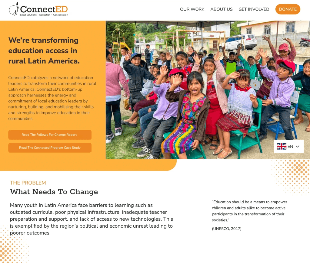
Above-the-Fold Clarity: Redesigned the hero section and primary navigation to answer three questions: What is ConnectED? Why does it exist? How does the model work?
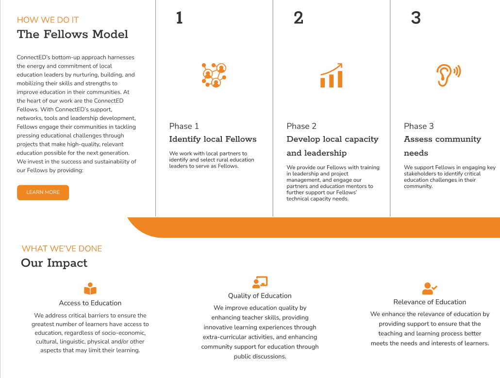
Visualizing the 7-Phase Model: Designed a visual breakdown of the fellowship lifecycle on the homepage so visitors can scan the process before diving deeper.
Embedded Accordion FAQ: Instead of a standalone FAQ page, I placed a collapsible FAQ directly in the browsing flow, right after visitors learn about the model and impact, which is when questions about getting involved come up. I started with a wireframe to align with the client on structure, then explored three color treatments in ConnectED’s orange-and-white branding before finalizing.
2. Designing an Empathetic Donation Experience
Impact-Linked Tiers: Structured giving around $50, $100, $150, $200, and $250 tiers, each paired with what that amount funds.
Frictionless Modal Integration: Designed layout support for an Every.org donation modal offering Apple Pay, Venmo, credit, and bank transfer while keeping the brand consistent.
3. Post-Donation Engagement Hub
Beyond the Thank-You: I replaced the generic confirmation screen with a hub built around four goals: transparency about how donations are used, donor trust, continued involvement, and staying connected. It brings together newsletter signup, paths to partners, fellows, and the team, Charity Navigator certification, volunteer options, and social sharing, with copy written to feel like a welcome into a community rather than a receipt.
4. Interactive Testimonials
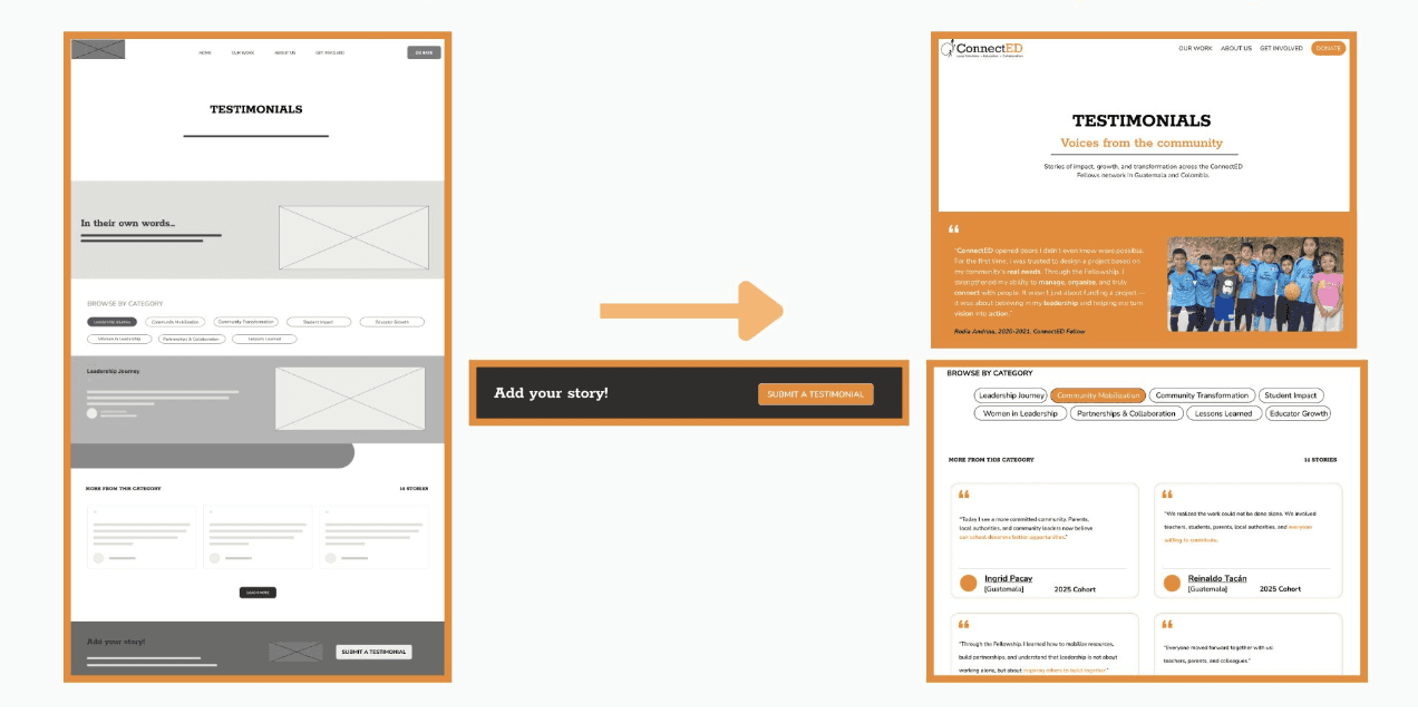
Explore by What Matters to You: I turned a static wall of quotes into a filterable page with categories like Leadership Journey, Community Mobilization, Student Impact, and Women in Leadership, so partners and prospective fellows can each find the stories that speak to them.
Add Your Story: I added a submission path so fellows, donors, and partners can share their own experiences, which keeps the page fresh without extra work for staff.
5. Bilingual Newsletter & Analytics (team build)
Language-Based Routing: Newsletter signups route to separate English and Spanish lists with double opt-in, so Spanish-speaking fellows receive content in their own language.
GA4 Tracking & Dashboard: We defined a tracking plan for key actions (donation clicks, newsletter signups, volunteer and partner clicks, report downloads) and built a dashboard that breaks down traffic and engagement by channel, including WhatsApp and Facebook.
04. Design System & Constraints
Mobile-First Responsiveness: Optimized touch targets, modals, and navigation for mobile, since many visitors arrive from social media and WhatsApp links.
Modular Maintainability: Built reusable Elementor components in
#2C4450(Primary Blue) and#EE8721(Accent Orange) so client staff can update copy and fellow stories on their own.No Added Cost: Built almost entirely on tools the client already paid for (WordPress, WPForms, Elementor add-ons) plus free tiers, so the redesign added essentially no new software cost.
05. Key Success Metrics
Before this project, the team had no visibility into who was visiting or what was working. We built a tracking plan for the actions that matter and turned it into a dashboard the team can read on their own.
We defined these metrics with the client and track them in GA4:
Increased Time on Site: Targeting a 25% to 30% increase in average session duration by replacing academic language with clear, structured storytelling.
Lower Homepage Bounce Rate: Targeting a 15% to 20% reduction in landing page drop-offs through restructured information architecture and clearer calls to action.
Higher Donation Conversion: Tracking completion rates across the new Every.org impact-linked modal, leveraging multi-payment options like Venmo and Apple Pay to reduce drop-off.
Engaged Donor Traffic: Early data shows donor-campaign visitors have an engagement rate above 80%, the highest of any channel.
Scalable Client Handoff: Delivered a fully maintainable, low-code WordPress component library that non-technical client staff can update independently without developer support.
Project Overview
My Role: Product Designer
Timeline: May – August 2026, ongoing
For: ConnectED Fellows, in partnership with Develop for Good
ConnectED Fellows supports local education leaders across Guatemala and Colombia. As a Product Designer on a Develop for Good team, I redesigned the platform's core user flows, homepage narrative, and donation experience to help non-technical stakeholders connect with prospective donors and partners.
01. Context & Problem Space
The Background
ConnectED Fellows is a non-profit that equips local educators in rural Latin America to lead community-driven educational projects. By expanding into Colombia, their network now reaches 92 schools and over 19,000 individuals.
Despite their growing real-world impact, their website—the primary touchpoint for donors, corporate partners, and prospective fellows—was underperforming.
The Problem
The existing web experience failed to convert casual visitors into active supporters due to four critical design friction points:
Dense, Academic Language: The site used heavy academic terminology rather than clear, relatable storytelling. Visitors struggled to quickly grasp what the organization actually does.
Opaque Value Proposition & Model: The core 2-year fellowship model and its 7 distinct phases were buried across subpages instead of being clearly introduced on the homepage.
Unclear Donation Impact: The donation process felt transactional. Donors couldn't visualize how specific gift amounts ($50 vs. $250) directly created change in rural classrooms.
Dead-End Post-Donation Flow: Once a donation was completed, the experience ended abruptly without guiding supporters toward other ways to stay involved.
Technical Constraints: The client had no technical staff, meaning all design solutions needed to be modular and easy to manage inside WordPress without custom code.
02. Research & Strategic Design Goals
To solve these challenges, we established three primary design objectives:
Clarity & Storytelling: Restructure the Information Architecture (IA) so any visitor can understand the mission, model, and geographic reach within 10 seconds of landing.
Transparent Giving: Design an intuitive, impact-linked donation experience with clear preset tiers and flexible payment options.
Sustained Engagement: Create a post-donation hub that converts one-time donors into long-term community members.
03. Design Execution & Core Flows
1. Restructuring Information Architecture & Narrative Flow
Above-the-Fold Clarity: Redesigned the hero section and primary navigation to answer three fundamental user questions: What is ConnectED? Why do they exist? How does the model work?
Visualizing the 7-Phase Model: Designed an intuitive visual breakdown of the fellowship lifecycle directly on the homepage, allowing users to scan the process before diving deeper.
Responsive Accordion FAQ: Built a collapsible FAQ component near the footer to resolve common donor and partner questions without cluttering the primary content stream.
2. Designing an Empathetic Donation Experience
Impact-Linked Tiers: Structured the donation interface around standardized giving tiers ($50, $100, $150, $200, $250) paired with contextual details showing exactly what each amount funds.
Frictionless Modal Integration: Designed layout support for a seamless Every.org popup modal, giving donors flexible payment choices (Apple Pay, Venmo, Credit, Bank Transfer) while keeping brand consistency.
3. Post-Donation Engagement Hub
Beyond the Thank-You: Replaced the generic confirmation screen with an interactive engagement hub featuring newsletter sign-ups, corporate partner paths, and a "Meet the Fellows" story directory.
04. Design System & Constraints
Mobile-First Responsiveness: Optimized all touch targets, modals, and navigation stacks for mobile screens, catering to visitors arriving directly from social media and WhatsApp links.
Modular Maintainability: Built reusable Elementor layout components using
#2C4450(Primary Blue) and#EE8721(Accent Orange) so non-technical client staff can update copy and fellow stories independently.05. Expected Impact & Key Success Metrics
To evaluate the effectiveness of the redesign post-launch, we defined key performance metrics tracked through Google Analytics 4 (GA4):
Increased Time on Site: Targeting a 25% to 30% increase in average session duration by replacing academic language with clear, structured storytelling.
Lower Homepage Bounce Rate: Targeting a 15% to 20% reduction in landing page drop-offs through restructured Information Architecture and clearer calls to action.
Higher Donation Conversion: Tracking completion rates across the new Every.org impact-linked modal, leveraging multi-payment options like Venmo and Apple Pay to reduce drop-off.
Scalable Client Handoff: Delivering a 100% maintainable, low-code WordPress component library that non-technical client staff can update independently without developer support.